Brand Strategy
Connecting owners to their businesses.
As a business owner, your company’s brand is reflection of you. It can be quite personal – which is why you need an objective and strategic plan for the development and execution of your brand.
This is where I step in.
Brand Audit
An objective audit of your existing brand messaging and visuals.
Brand Strategy
A written analysis, strategy and execution for your brand.
Visual Branding Guide
A definitive guide of fonts, colours, photography styles – to keep you DIYers in check.
Client Work
Brand Strategy is a bit of a toughie to showcase – the back-end work, research and analysis are all key components of the deliverable.
Key messages, tone, positioning – they all need to live in that sweet spot where your customer’s needs overlap what you uniquely offer in a way that’s not being met by anyone else in your industry.
Below are some samples of my work.
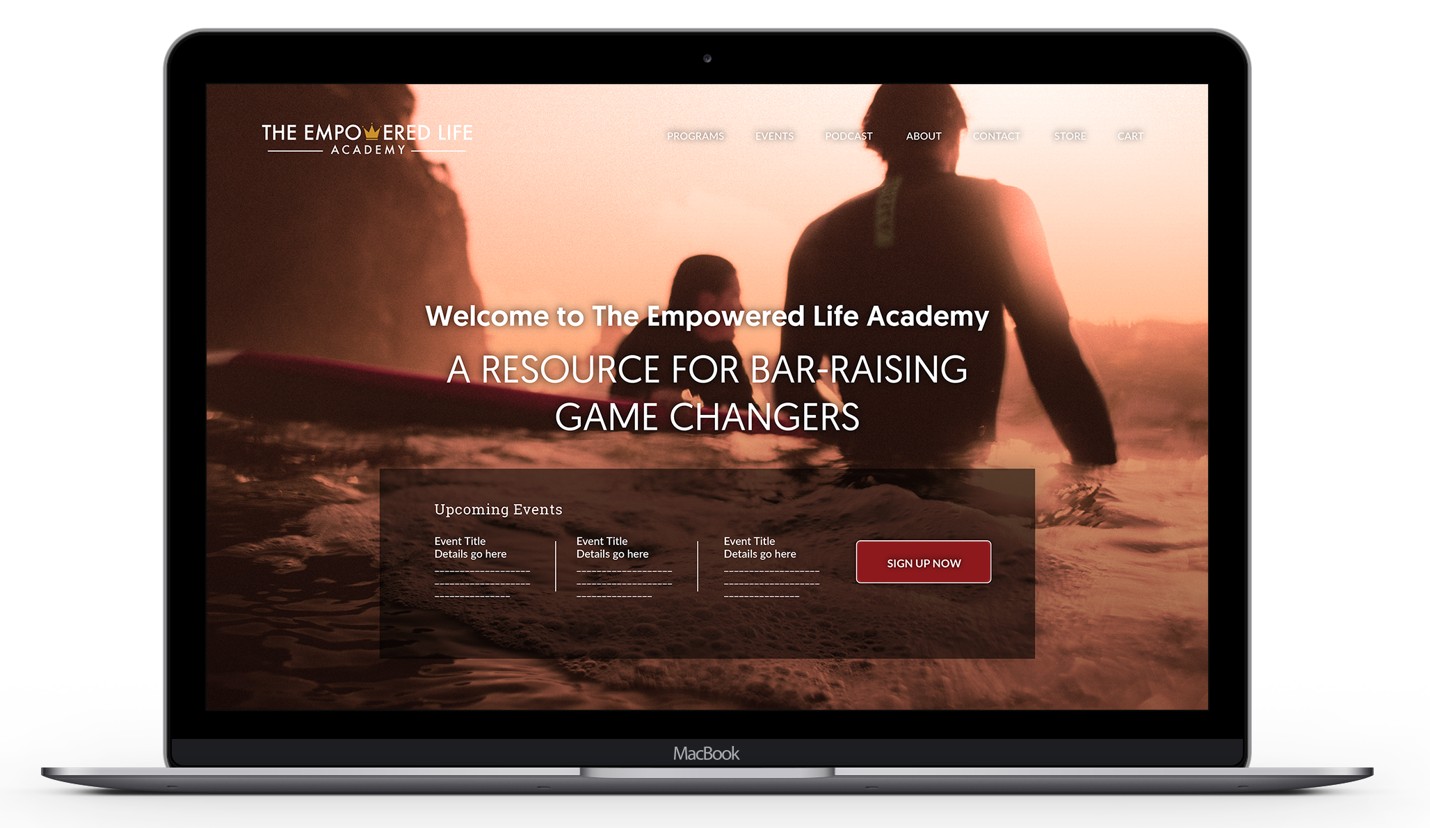
The Empowered Life Academy
Training Academy + Resource Brand – with multiple ways to interact including events, classes and one-on-one coaching
Where success means connecting with and bringing out the best in yourself and others.
Make your mark on the world.
You’ve been looking for a better way. Now, you’ve found it. Inspire with patterns of excellence. Lead the way.
Communication + Connection
Equipping leaders with the skills to excel in an increasingly complex world.
Kara Business Solutions
Personal and Small Business Taxes and Bookkeeping

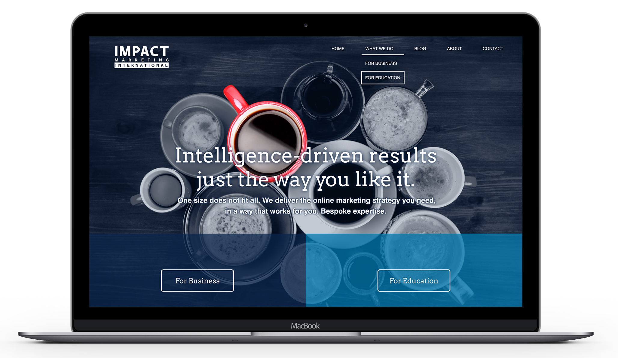
Impact Marketing International
Internationally focused digital marketing agency
Teri Holland Coaching
Performance Coach, NLP Practitioner + Trainer

My Working Broker
Hardworking, upfront mortgage brokerage

Katy Loewen Co.
Leadership + Executive Strengths Coaching

Living Langley Real Estate
Community-focused real estate team

Axis Impact Marketing
Brand strategy for a Vancouver mortgage brokerage

Deep Blue
Competence, Authority, Depth, Stability, Trust
City of Vancouver Green
Wisdom, Comfort, Growth, Freshness, Prosperity
Vibrant Orange
Assurance, Warmth, Enthusiasm, Success, Practicality